alpha
fall 2020
packaging and product design
This project began in a collaborative packaging studio. I was given the opportunity to work alongside two communications designers, Leah Brinkman and Laura Yoder, and one fashion designer, Alexis Piascik.
This studio allowed me to take a deep dive into packaging design, material consideration, and collaborative work.
alpha
Our group is taking a deep dive into the tampon market space. Too often have we noticed that the packaging is too loud (physically and graphically), not sustainable, and overly gendered. There is a wide market for tampons and their users, and there is not only the aesthetic but also the health concerns associated with tampons. We are looking to create something that has been thoughtfully designed and considers all aspects of period care.
primary research
The first task was to send out a survey to a wide array of tampon/pad users. Their ages and their opinions on tampons including their packaging, design, and effects on the environment were noted.
After reviewing our feedback, there was a consistent viewpoint that discrete wasn’t the right word to use when describing our intentions.
There were a lot of responses that pointed out having a period shouldn’t come with embarrassment. It’s something natural, and it shouldn’t be hidden, more that people would prefer something simple.
FEEDBACK SUMMARY
Clean/minimal packaging
Neutral/muted colors
Sleek design
“Less ugly”
Remove gendered quality
Quieter wrapping
Sturdier packaging
QUOTES FROM PARTICIPANTS
“I wish that tampons weren’t as “feminine” because that definition has changed significantly in the last decade”
“I love how [brand name] has a semi-bathroom-shelf-acceptable look to it. I do like the idea of it being subtle to keep on display but recyclable/refillable”
“Hate the pink. Hate the box. Hate how fun they make it seem when it’s me bleeding out of my vagina for a week straight”
market analysis
After the initial survey regarding tampons and other feminine care, it was important to take a deep dive into the existing market space. It was important to look at low, medium, and high-end products.
To the left is a graphic outlining the products we investigated (in black) and the market space desired for ALPHA (in orange). You can see by the breakdown of the benchmarking that ALPHA is a higher-end product, with a matching price point. However, while it comes at a higher price range, it was important that this would be a widely accessible product.
In the end, it was decided that ALPHA is a subscription-based service that allows consumers to order the starter kit and then subscribe to monthly deliveries of tampons throughout the rest of the year.
primary users
TAGLINE
bleed shamelessly.
product ideation
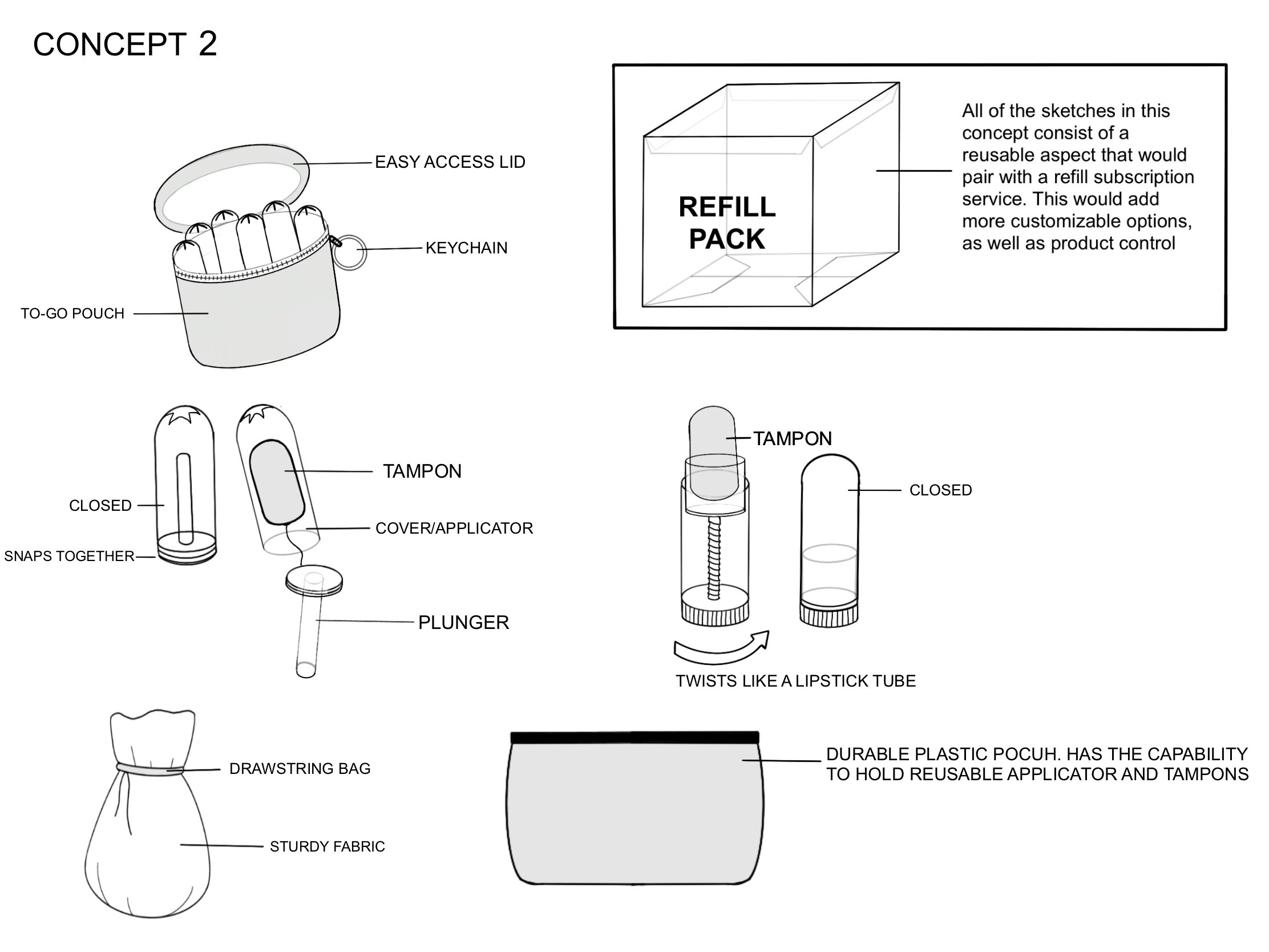
Below are my initial conceptualizations for the potential product design as well as my initial color palette and wordmark designs. As a group we all brainstormed, but my work is featured below.


*Moodboard Created by Alexis Piascik
final branding
To the left is ALPHA’S Style Guide. Here the primary and secondary logos are laid out, as well as the tagline: bleed shamelessly, the color palette, and typeface choices.
All decisions were made together as a group and were chosen to best represent the brand identity behind ALPHA.
*This style guide was laid out by Leah Brinkman and Laura Yoder.
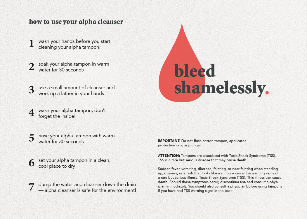
how-to informational card
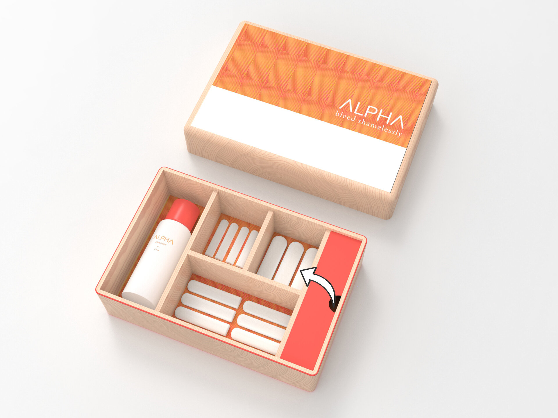
The ALPHA team began by designing a starter kit. It’s important to ensure every user receives everything they need to begin using the product (tampon applicator, tampons, cleanser, etc).


what’s included


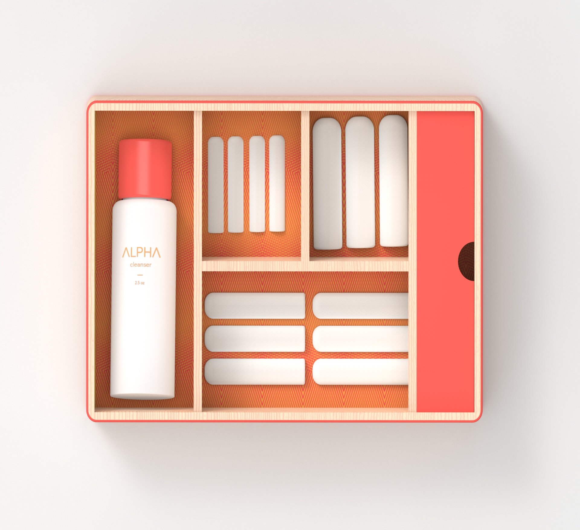
ALPHA is marketed as a higher-end product, the bamboo telescoping lid allows for a luxurious unboxing moment. The user can open the kit and then access the different compartments: the cleanser, the cotton tampons (options for a variety of sizes [different flows]), as well as the intimate experience of revealing the ALPHA tampon.
This was a carefully considered design choice to separate the tampon from the rest of the box. It offered a solution for the overall cleanliness/hygiene of the system as well as keeping the whole experience interactive. ALPHA is a product that is designed to be displayed loud and proud. Periods are nothing to be ashamed of, and during this time there should be a consideration to the experience being had by its user. Whether it sits on your bathroom shelf or lives in a drawer, period care is a big part of the lives of those who menstruate, why not make it comfortable and easy to bleed shamelessly.
final design renders


